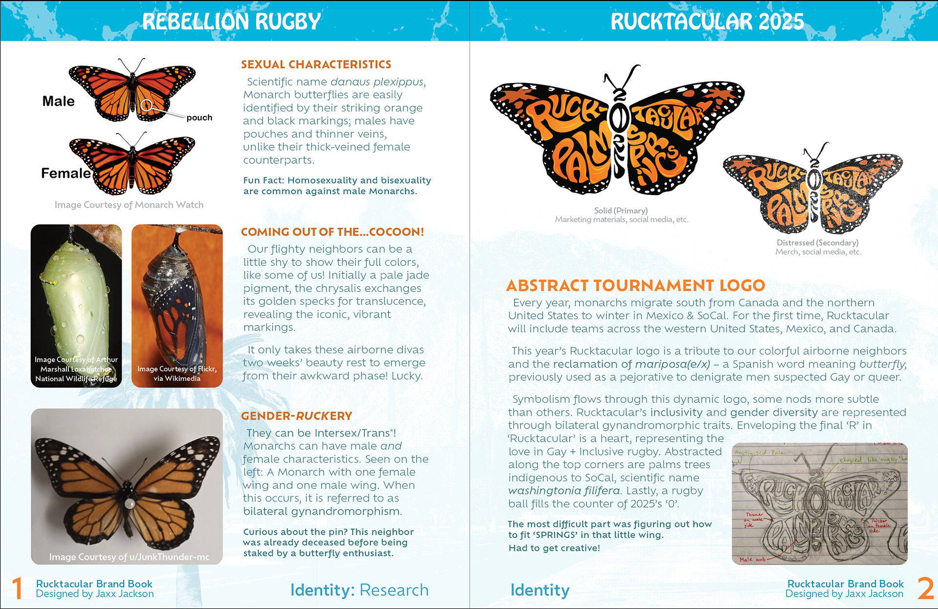
tournament logo
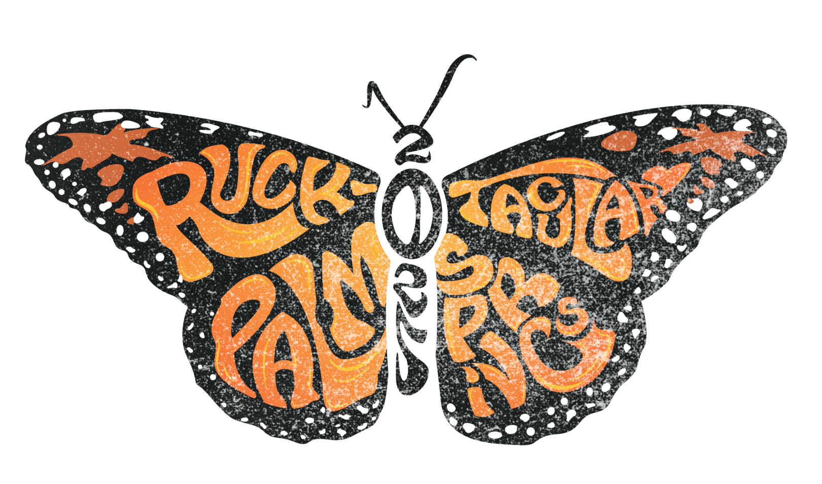
solid & distressed
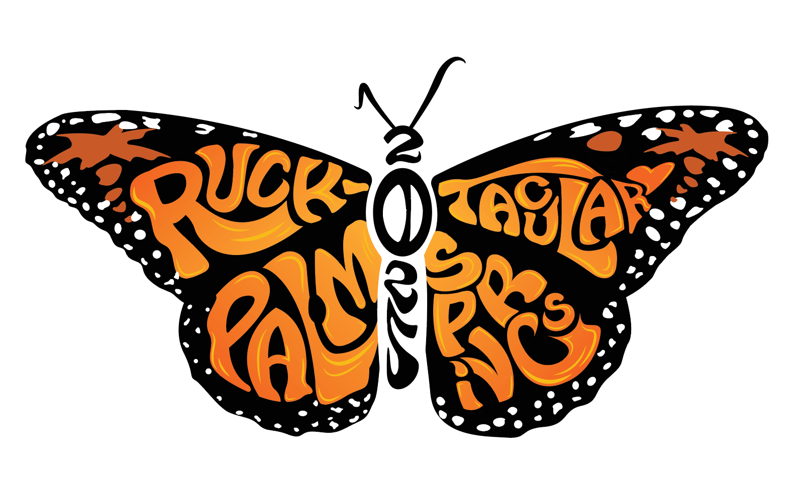
Every year, monarchs migrate south from Canada and the northern United States to winter in Mexico & SoCal. For the first time, Rucktacular will include teams across the western United States, Mexico, and Canada.
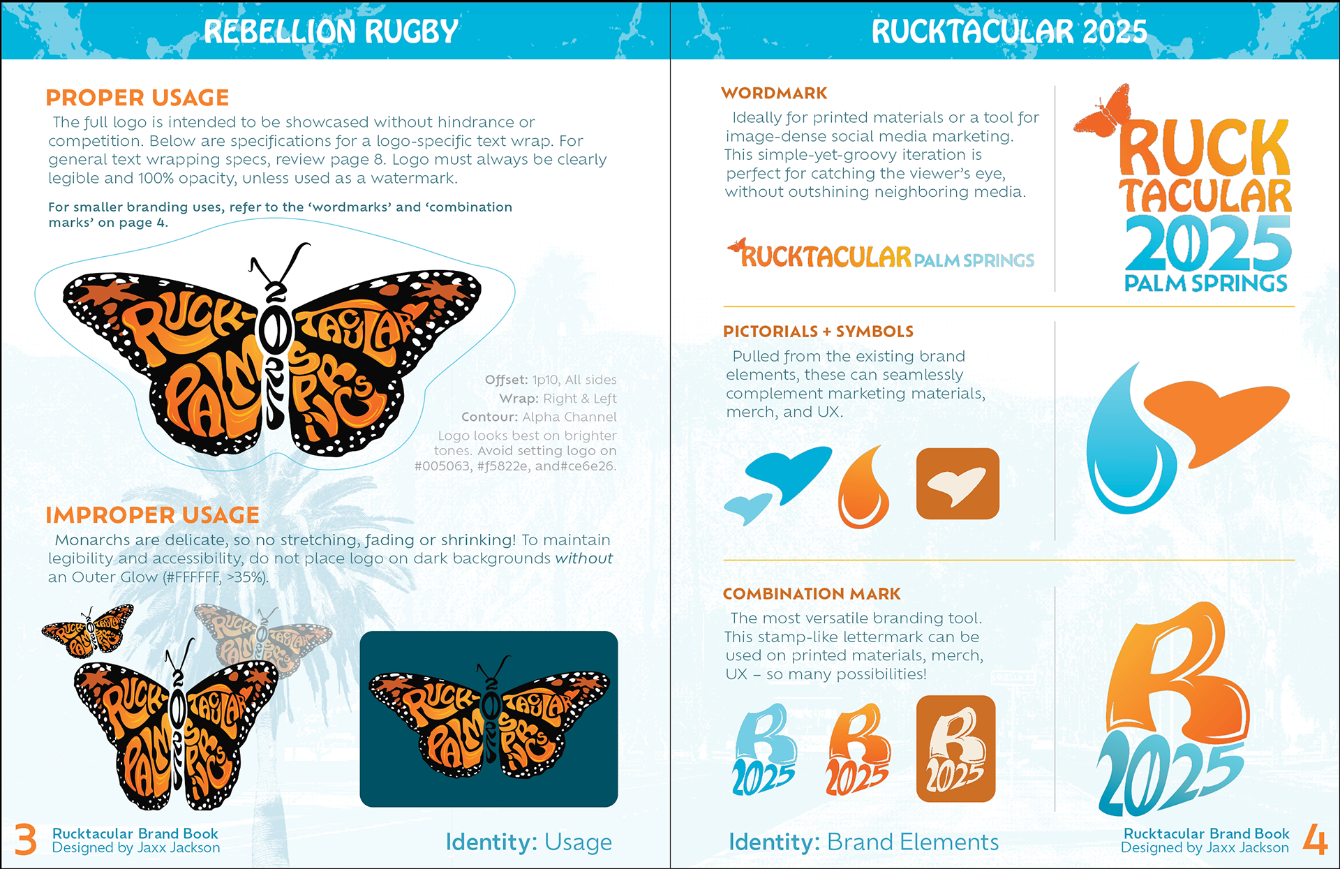
This year’s Rucktacular logo is a tribute to our colorful airborne neighbors and the reclamation of mariposa(e/x) – a Spanish word meaning butterfly, previously used as a pejorative to denigrate men suspected Gay or queer.
Symbolism flows through this dynamic logo, some nods more subtle than others. Rucktacular’s inclusivity and gender diversity are represented through bilateral gynandromorphic traits. Enveloping the final ‘R’ in ‘Rucktacular’ is a heart, representing the love in Gay + Inclusive rugby. Abstracted along the top corners are palms trees indigenous to SoCal, scientific name washingtonia filifera. Lastly, a rugby ball fills the counter of 2025’s ‘0’.
Save the Date
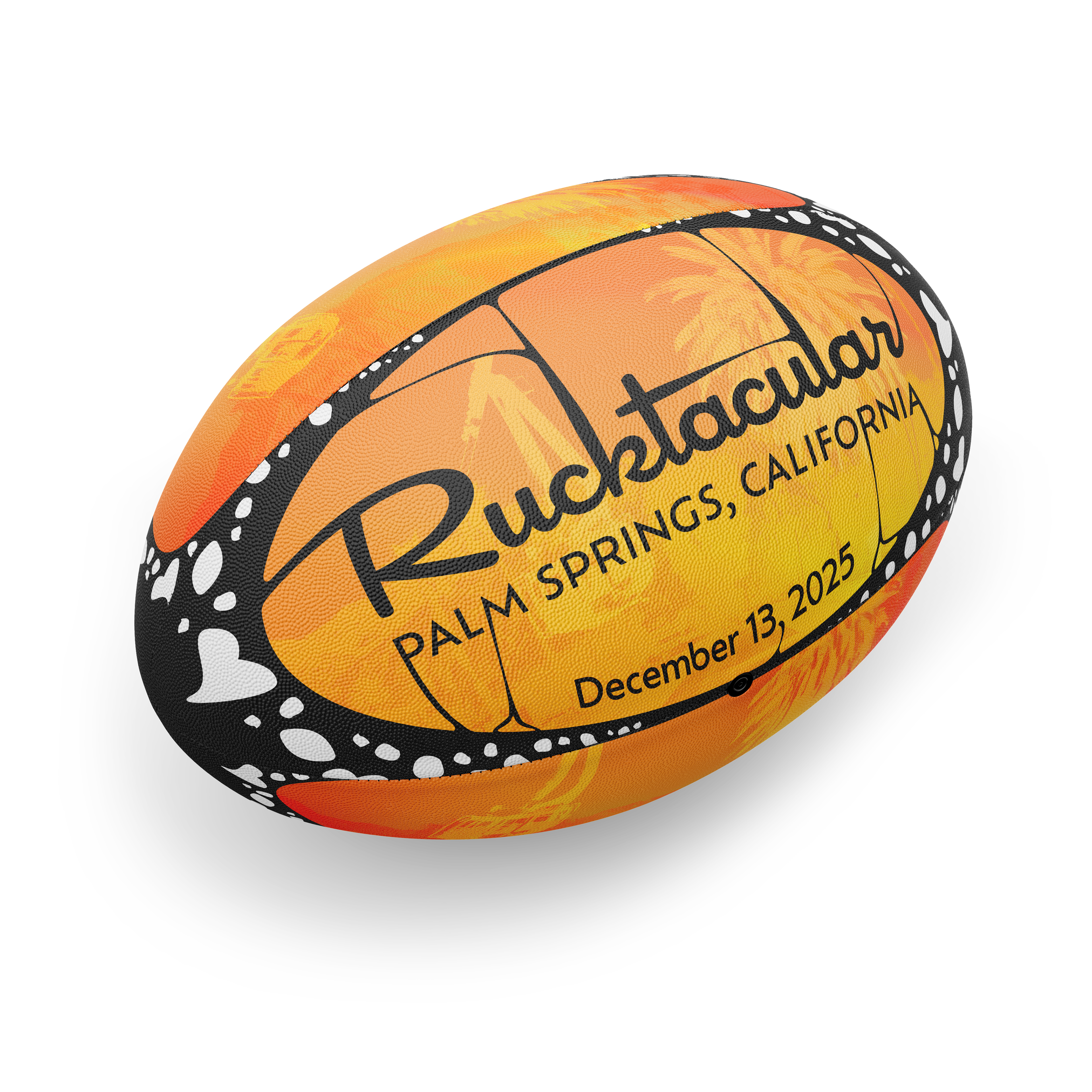
Stylized after monarch butterfly wings, this rugby ball conceptualizes aspects of Monarch butterfly characteristics. This beauty never made it to the production line, unfortunately!
brandbook
A comprehensive breakdown
This book is the culmination of hours of work, diving deep into the sexual characteristics of Monarch butterflies, custom letterforms,
Digital Banners
Facebook & Mailchimp
UX Backgrounds
mobile & Desktop
UX Background – Mobile
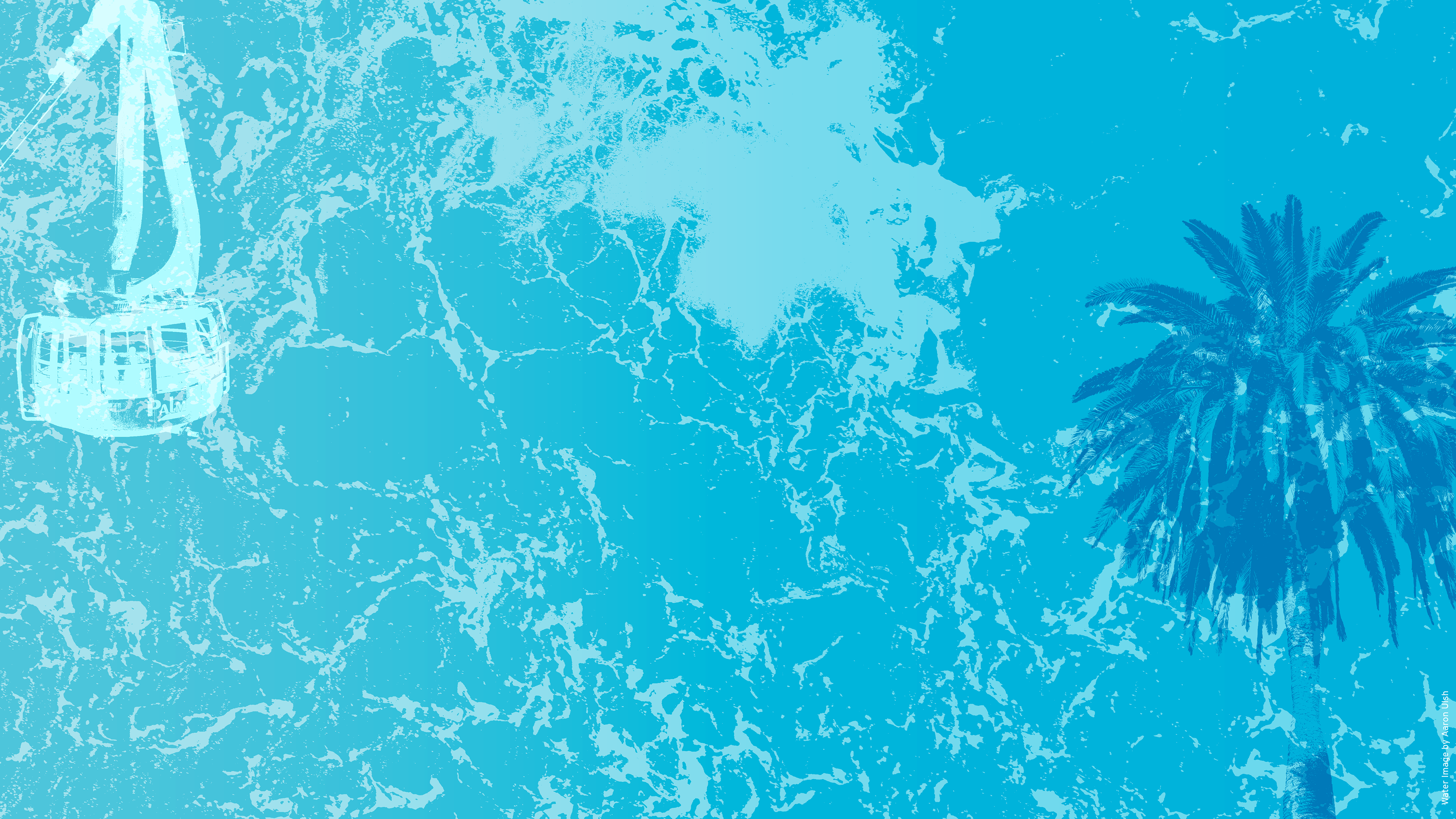
UX Background – Desktop
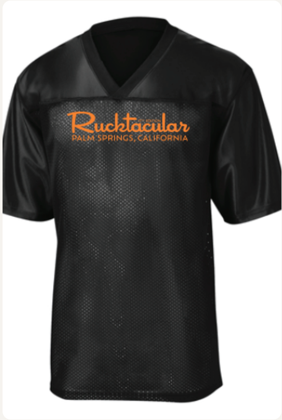
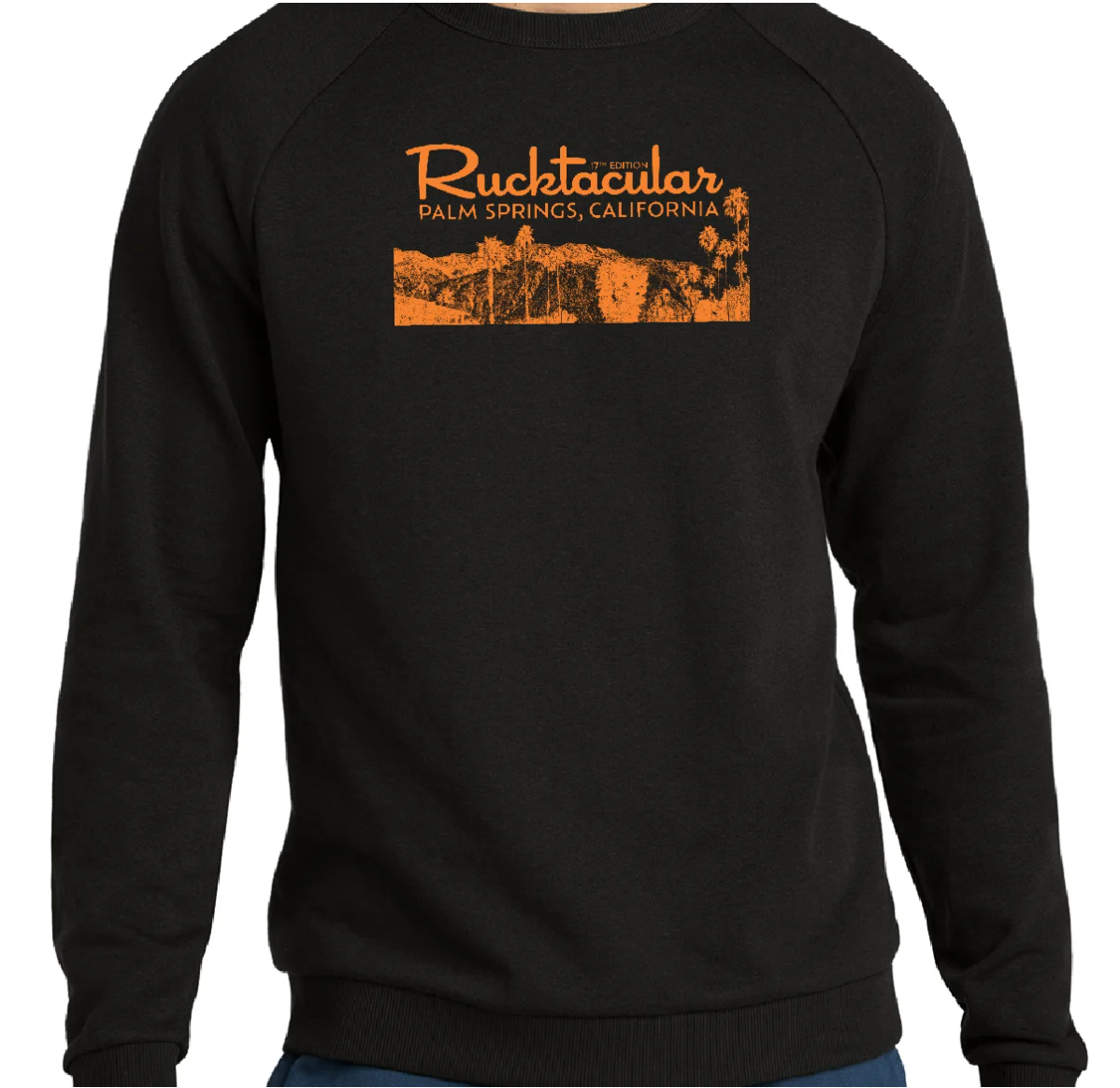
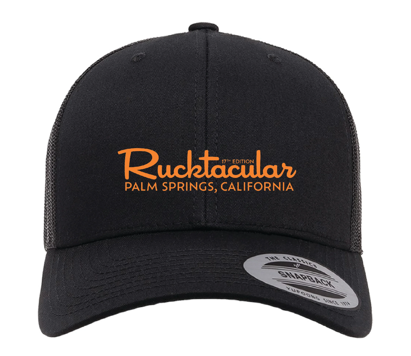
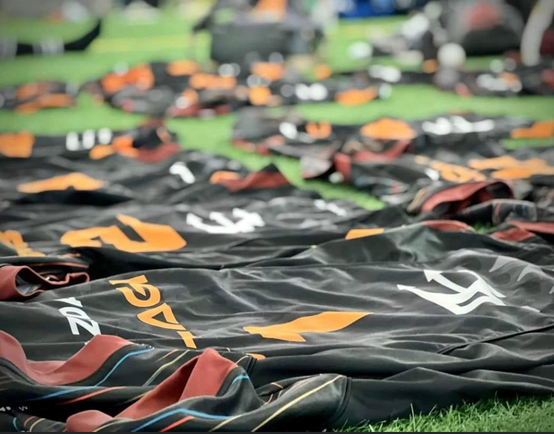
Merch
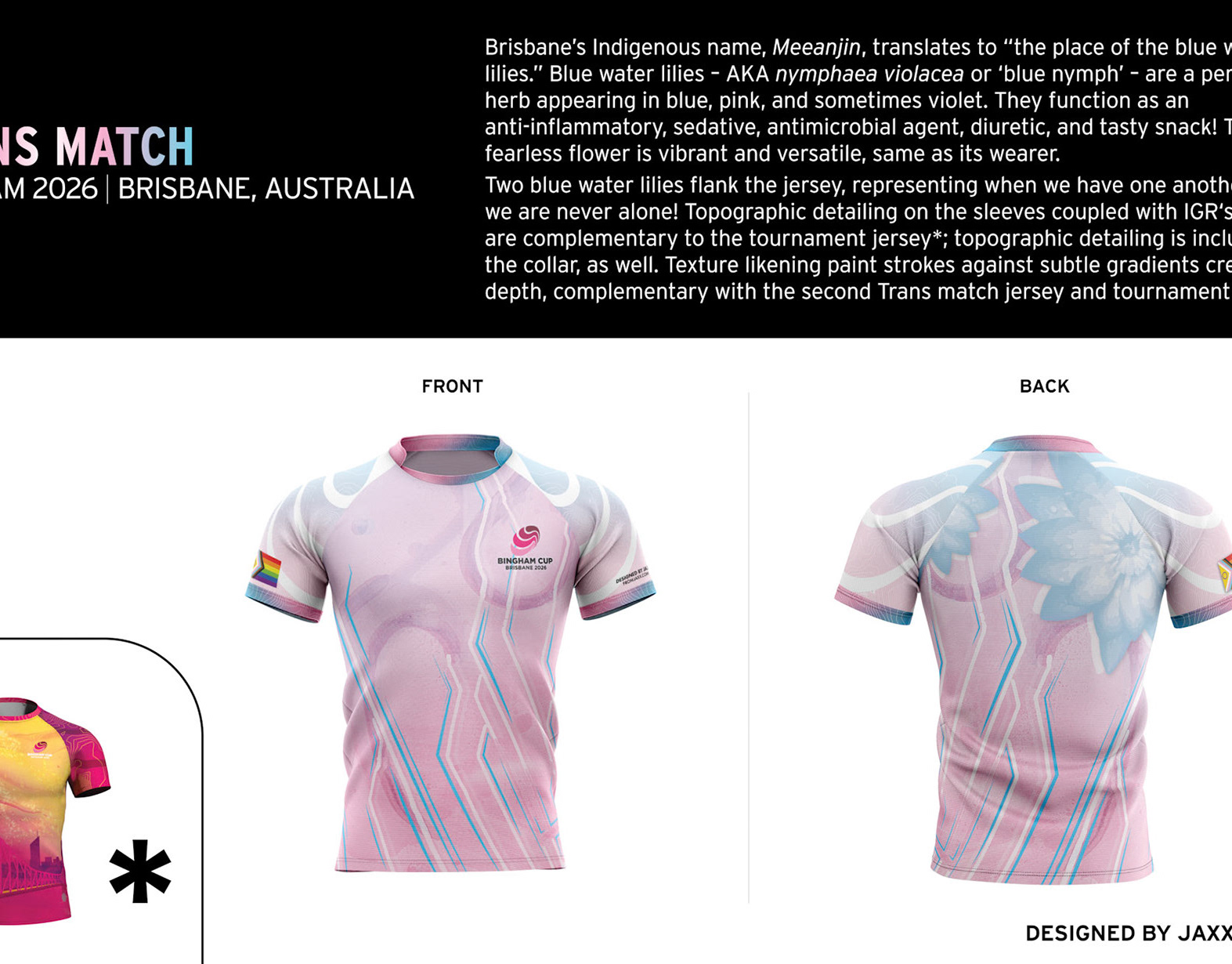
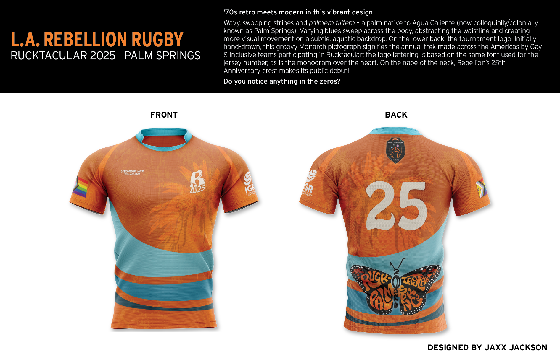
Commemorative Jersey
Retro meets modern in this vibrant design! Wavy, swooping stripes and palmera filifera – indigenous to Agua Caliente
Clothing + design
A simple 'n' sweet design, with a familiar flair! Inspired by the iconic Palm Springs sign, this monochromatic design showcases the modern terrain of Agua Caliente (AKA Palm Springs).